Fonts — built-in and imported
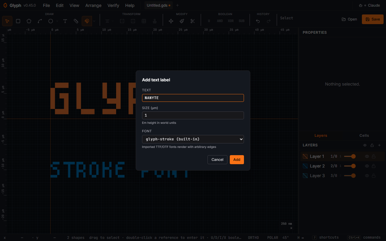
Glyph ships with glyph-stroke, a built-in rectilinear (0/90°) pixel-derived stroke font built from Spleen 12×24 (BSD-2-Clause, © Frederic Cambus). Every edge is at exactly 0° or 90° (each glyph is a union of pixel rectangles), so it's the most fab-safe face on offer — simple axis-aligned polygons, no Bézier curves and no arbitrary angles to flatten. A letter with a counter (O, 8, B…) arrives as several ABUTTING pieces — two for most, three for $ and &, seven for % — rather than one ring with a hole, because GDSII has no hole primitive. The pieces share edges and share no area, so a merge downstream reassembles the exact letter; the counters stay open on screen and in every export. It's always available, requires no setup, and is the default for every new Text shape. The charset covers ASCII; the Latin-1 symbols and accented capitals (± × ÷ ² ³ ¼ ½ § © ® µ ° É Ñ Ø …); the whole Greek alphabet in both cases (Δ λ Ω α θ φ π σ …); arrows ← ↑ → ↓; and ≈ ≤ ≥ ≠ √ ∞ € • … – —. So labels like "40 µm, 90°", "Δx = 2 µm", "λ/4" or "50 Ω → pad" need no workaround font. The font has capitals only: lowercase Latin letters, accented ones included, draw as their capitals (é as É). Greek lowercase keeps its own letters, because λ and Λ mean different things. The Ohm sign draws as Ω and the minus sign − as -. The Greek letters Spleen lacks, and the arrows, ∞ and ≠, were drawn for Glyph in Spleen's style. Adding them changed no existing character, so labels in existing documents draw and export exactly as before.
 View full image
Label size defaults
The first label you add in a session is sized to fit the view: Glyph takes the visible height, divides it by 20, and rounds to a tidy 1/2/5 number (so on a fresh document at the default zoom you get a 5 µm label, not a 1 µm speck that needs a zoom-in to read). Every label after that pre-fills with the last size you used, so a run of labels stays consistent — change the size once and the rest follow. Opening a different document (or switching tabs) re-arms the view-based size, so a 5 mm wafer label never carries over onto a 100 µm chip.
Turn this off with ; the fixed Default text size below it then applies to every new label, as it did before.
Common fonts
The font picker also lists a Common fonts group with a few free, openly-licensed faces that ship with Glyph — currently PT Sans (sans, © ParaType Ltd.), PT Serif (serif, © ParaType Ltd.), and IBM Plex Mono (monospace, © IBM Corp.). All three are used under the SIL Open Font License 1.1; the unmodified font files and their license texts are distributed with the app (the full license is linked from Help → About). They're downloaded from your own copy of Glyph on first use (no external network call), then embedded into the current document exactly like an imported font — so once selected they round-trip and persist just like §"Import a TTF/OTF font" below. After a common font is in a document it moves out of the "Common fonts" group and into the main list, and you can remove it via File → Setup → Manage fonts….
Glyph Stencil (stencil) is also in that group: a vented font. Every enclosed counter (the inside of O, A, B, 8, the rings of %) is opened by a gap one stroke wide, so no part of a letter is left as a loose island. Use it for text written as openings in a membrane, a shadow mask or a stencil, or etched through a layer, where a normal font's counters would fall out. It is monospace and rectilinear on a 50 nm design grid at its native size (strokes 100, capitals 750 tall). Unlike the built-in font it has real lowercase and the Latin-1 accented letters. Its capitals are exactly the text size tall, where the built-in font's capitals are about 78 % of it. It is drawn from the same Spleen pixel font as the built-in font (BSD-2-Clause, © Frederic Cambus), with the vents added by Nanyte; the licence ships with the app. It is itself a KLayout-format GDS font (next section), so the same file also loads in KLayout's text generator, where only the ASCII characters are reachable.
Import a KLayout GDS font
Import font (TTF, OTF, KLayout GDS)… also accepts a .gds font in KLayout's text-generator format: one cell per character, named by the character (A) or its 3-digit code (032 = space), with the glyph on layer 1/0 and a frame box on layer 2/0. Fab and university vented fonts are often shared in this format. Glyph reads it the way KLayout does. The font is monospace at the width of the widest frame. A missing lowercase letter uses its capital. A cell without a 2/0 frame is not part of the font. The font is named after the file, and the text size is the height of its H. Paths on layer 1/0 and references inside character cells are not imported, and Glyph says so when it finds them. As with a TTF, the font file is embedded in your document, so check its licence before you share the .gds, or flatten the text first.
Import a TTF/OTF font
The font picker (the dropdown next to the Text dialog's font field, and again in the Properties panel for selected text) ends with an "Import font (TTF, OTF, KLayout GDS)…" entry. Pick a .ttf or .otf file (or a KLayout .gds font, above); Glyph parses it, flattens every glyph outline to linear polygons, and attaches the result to the current document. The font is now selectable for any text shape in this document.
Imported fonts are persisted with the document: they survive autosave, tab switch, and a recovered session, and they are embedded into the binary .gds itself. Because GDSII has no font primitive, Glyph stores the original font file inside a private __GLYPH_FONTS__ cell: labels on layer 255/255 (the next free datatype of layer 255 if your design uses 255/255 itself) that carry the font data. Your top cell holds one reference to that cell, placed at a point of your own design, so the file has one top cell (a bare KLayout source($input) deck runs) and your top cell's bounding box is unchanged. Other tools (KLayout / Clewin) do not draw your text in that font, and a DRC or LVS deck sees the extra labels only if it reads layer 255/255. Glyph reads the font back when it re-opens the file, also after KLayout merges two such files into one or KLayout or gdstk flattens it. If another tool drops part of the font data, Glyph says so when it opens the file and draws that text in the built-in font. A file saved by Glyph v0.191 or earlier keeps the font in a second top cell instead: give a KLayout deck source($input, "TOP") for it, or open and save it again here. An older Glyph opening a new file still reads the font; it keeps one empty reference, which its next save drops with a note. Note that this means a .gds you share carries the embedded font binary; if you'd rather it didn't (font-licensing, file size), flatten the text first (below) so only polygons remain.
Letters with enclosed counters (O, B, 8, %) are converted to single hole-free outlines when
a font is imported, so they draw and export as real rings rather than filled blobs; the hair-thin
slit that joins a counter to its outline is zero-width and never fabricates.
Manage fonts (File → Setup → Manage fonts…)
Lists every imported or common font (TTF, OTF or GDS) attached to the active document, with a Remove button per row. The built-in stroke font is not shown (it lives in code and is always available). Removing a font that's referenced by existing text shapes does NOT delete the shapes — they silently fall back to the built-in stroke font at next render, preserving their content and position.
Flatten text to polygons
Right-click a text shape (or Arrange → Flatten text) to replace it with the boundary polygons of its glyphs. After flattening, the result is just polygons — the font reference is gone and the shape no longer responds to size / font / letterSpacing changes. Flatten before final .gds export if you need the text to land on layout layers in downstream tools.